Swiss Design · Editor Theme
Swiss Design Editor Theme
VS Code + Cursor + terminal color schemes (Warp / iTerm / Ghostty) generated from the same theme tokens.
Palette
TypeInter
Live preview
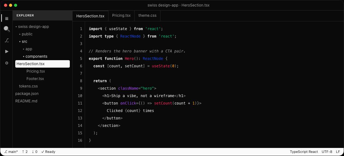
This is the real Swiss Design editor theme — actual rendered code, not a mockup.
Color tokens
- Primary
- #E63227
- Background
- #FAFAFA
- Foreground
- #1A1A1A
- Accent
- #2A2A2A
Typography
Heading
Inter
Body
Inter
What's inside
- VS Code theme
- Cursor theme
- Warp profile
- iTerm scheme
- Ghostty config
- Syntax token map
About the Swiss Design editor theme
Swiss Design is a Showcase design language with its own palette, typography, and component rhythm. This editor theme renders that exact Swiss Design system — the same color tokens, type pairing, radius, and spacing — as a production React + Tailwind CSS build, not a mockup. Drop it in as-is, or lift the tokens into an existing project so the whole surface reads as one coherent Swiss Design brand. Every component below is real, copy-pasteable code with dark-mode support out of the box.
See the full Swiss Design showcase