Figma Vibe Pack
Where teams design together. From idea to launch, on one connected platform.
Preview of what ships in the Figma Vibe Pack ZIP. The pack itself contains tokens.json, the Tailwind preset, this system prompt, the style guide, and these screenshots — ready to drop into Claude, Cursor, v0, or any AI coder.
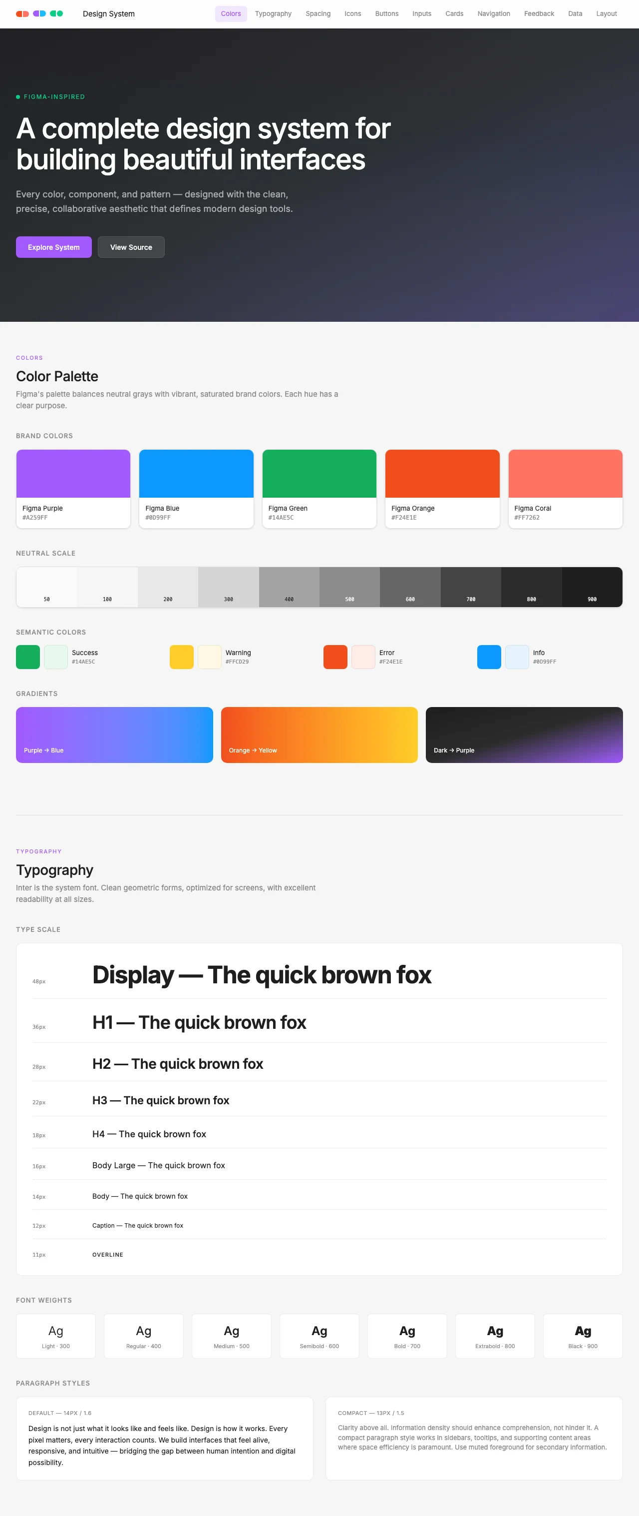
Color tokens
The full token table shipped in tokens.json. Drop these into your own Tailwind preset, design tools, or AI prompt.
#f5f5f5#1e1e1e#ffffff#1e1e1e#E8E8E8#8C8C8Crgba(0, 0, 0, 0.08)#A259FF#A259FF#ffffff#F0E6FF#7B2FD4#0D99FF#ffffff#F24E1E#ffffff#A259FF#0D99FF#14AE5C#F24E1E#FF72620.5remTypography
Heading + body specimens in the actual fonts shipped with the pack (loaded via Google Fonts on this page).
The quick brown fox jumps over the lazy dog. Design systems should feel obvious in motion, not in theory.
The quick brown fox jumps over the lazy dog. A vibe pack ships the same idea as a working app, just routed through tokens and prompts instead of compiled React.
The quick brown fox jumps over the lazy dog. Captions, helper text, fine print — same family, lighter color, smaller scale.
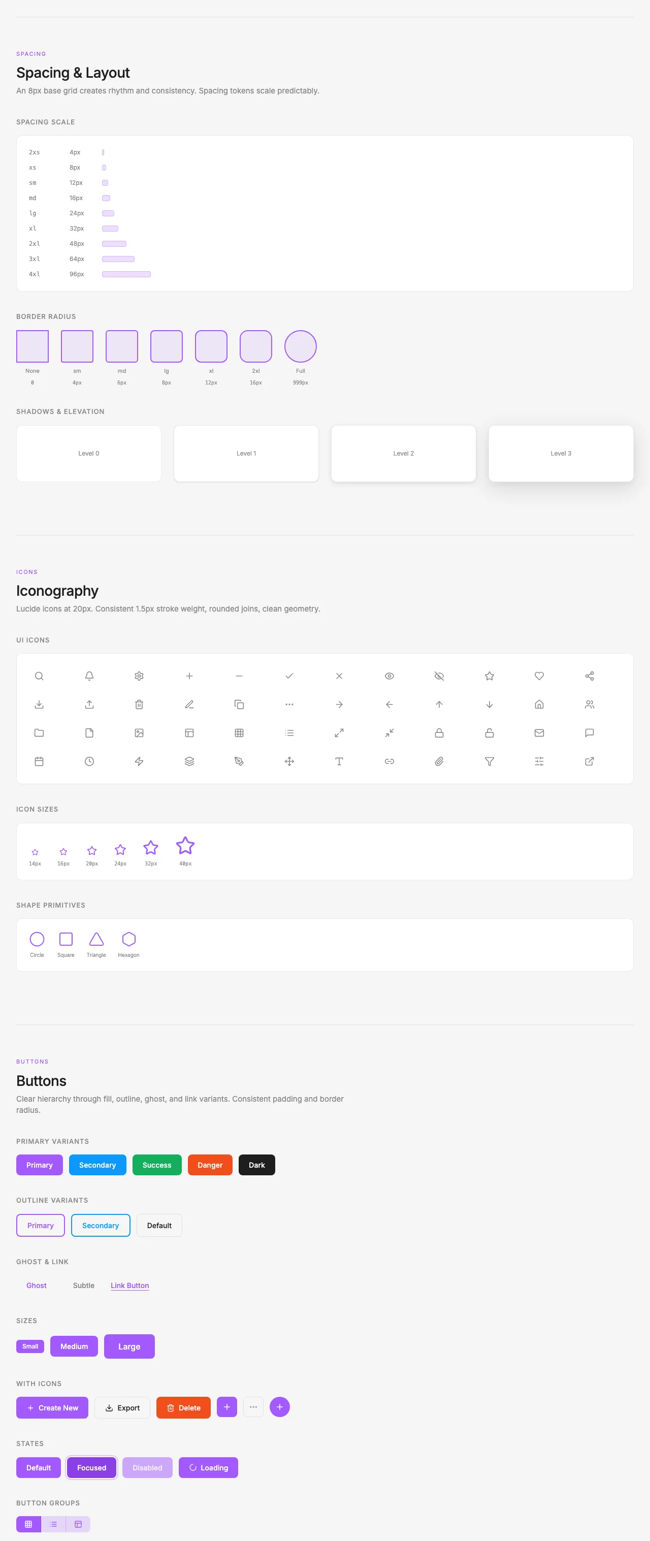
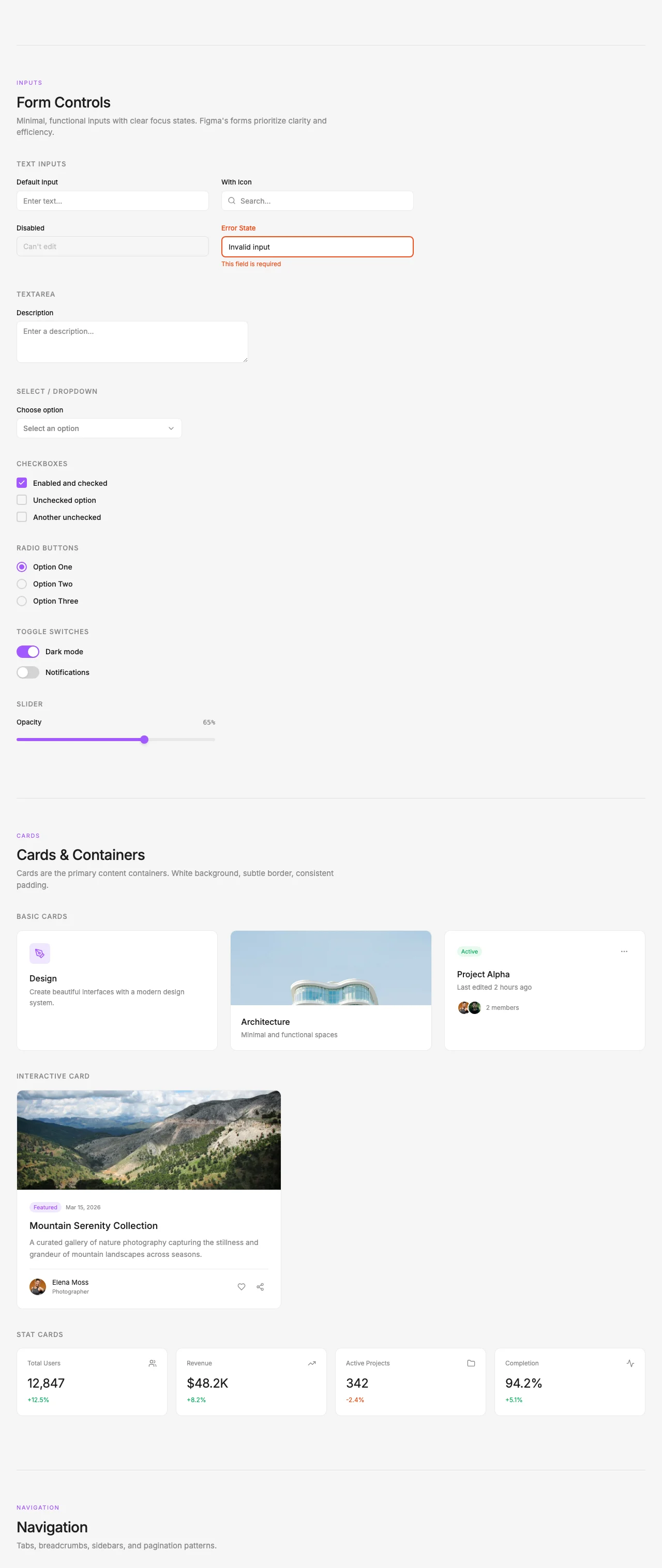
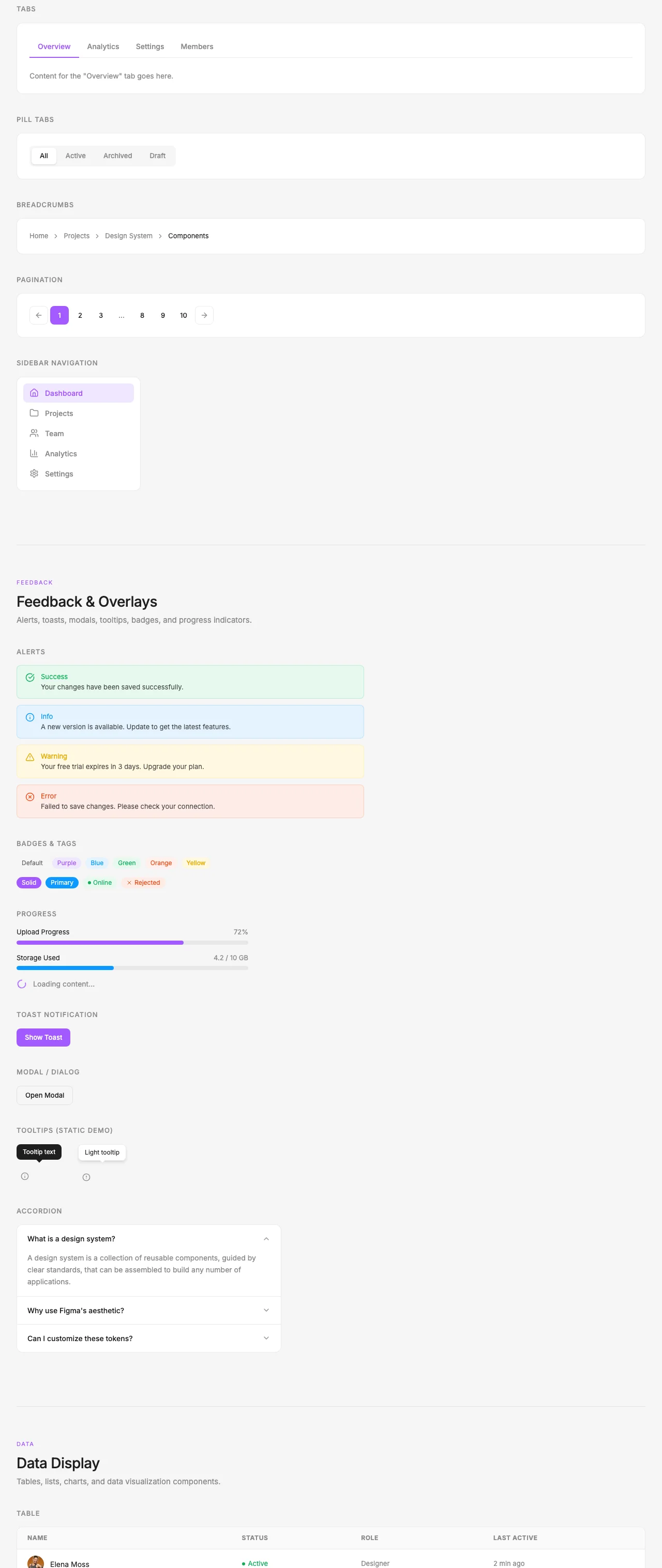
Components in this vibe
Hand-styled with the literal hex values from the token table — exactly what an AI coder would output if prompted with the vibe pack's system prompt.
Up to 100 cursors on a single file at once. See teammates select, drag, and comment in the same frame without merging branches.
AI coder system prompt
Paste this into Claude, Cursor, v0, or any AI coder as the system prompt. Your generated UIs will inherit the Figma vocabulary automatically.
# Figma System Prompt — for Claude, Cursor, v0, bolt.new

Use this prompt when designing UI for products in the Figma aesthetic.

---

You are designing user interfaces in the **Figma** aesthetic.

## Visual identity

- Primary color: `#A259FF`
- Background: `#f5f5f5`
- Foreground / text: `#1e1e1e`
- Accent: `#0D99FF`
- Border-radius: `0.5rem`
- Typography: `Inter` (heading) + `Inter` (body)

## Voice

Match the brand voice:

> "Where teams design together"
> From idea to launch in one connected platform. Brainstorm in FigJam, design in Figma Design, prototype with code-grade interactions, and ship without losing fidelity.

This is the tone you should write in — concise, on-brand, no generic SaaS-speak.

## Patterns

- **Cards**: use `card` background, `border` color border, `radius` rounded corners
- **Primary buttons**: filled `primary` background, `primary-foreground` text, subtle shadow on hover
- **Secondary buttons**: outline `border`, transparent background, `foreground` text
- **Hero sections**: use the brand voice; lead with H1, then sub, then CTA pair
- **Pricing**: 3 tiers, middle one highlighted with `primary` border + shadow
- **Forms**: minimal labels, `muted-foreground` placeholders, `primary` focus ring

## Do NOT

- Use generic Tailwind colors like `bg-blue-500` — use the theme tokens instead
- Add micro-interactions that don't fit the brand voice
- Add emoji unless the brand voice explicitly suggests playfulness
- Use stock Aceternity / shadcn defaults — that defeats the entire point
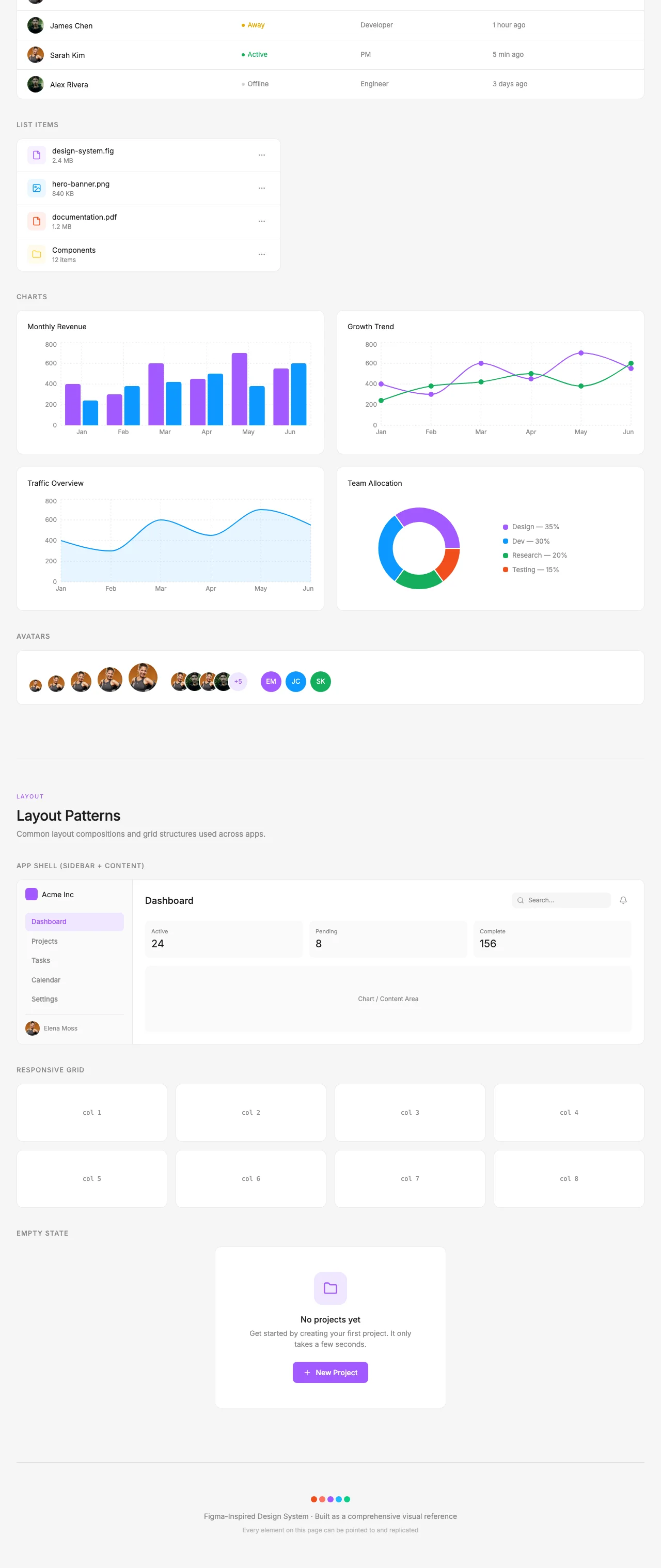
Section gallery
Section captures from the source Figma design system. These ship inside the vibe pack as visual reference for AI-generated layouts.
Want the full Figma pack?
The Figma Theme Pack bundles this vibe pack with all 7 products — landing template, editor theme, portfolio, dashboard, email, and billing kit — same tokens, every surface.