Moebius Vibe Pack
Arzach — a comics and graphic-novel platform for European BD, sci-fi serials and contemplative line-art storytelling.
Preview of what ships in the Moebius Vibe Pack ZIP. The pack itself contains tokens.json, the Tailwind preset, this system prompt, the style guide, and these screenshots — ready to drop into Claude, Cursor, v0, or any AI coder.
Color tokens
The full token table shipped in tokens.json. Drop these into your own Tailwind preset, design tools, or AI prompt.
#F5EDE0#1A1A2E#FAF4EA#1A1A2E#E8DFD0#6B6080#1A1A2E#2D3A8C#2D3A8C#F5EDE0#C75B3F#FAF4EA#3AAFA9#0B0B1A#C44536#FAF4EA#C75B3F#3AAFA9#2D3A8C#D4A843#8B5E9B0.25remTypography
Heading + body specimens in the actual fonts shipped with the pack (loaded via Google Fonts on this page).
The quick brown fox jumps over the lazy dog. Design systems should feel obvious in motion, not in theory.
The quick brown fox jumps over the lazy dog. A vibe pack ships the same idea as a working app, just routed through tokens and prompts instead of compiled React.
The quick brown fox jumps over the lazy dog. Captions, helper text, fine print — same family, lighter color, smaller scale.
Components in this vibe
Hand-styled with the literal hex values from the token table — exactly what an AI coder would output if prompted with the vibe pack's system prompt.
A pan-and-zoom reader built for landscape splash pages. Readers drift through panoramas instead of swiping through squares.
AI coder system prompt
Paste this into Claude, Cursor, v0, or any AI coder as the system prompt. Your generated UIs will inherit the Moebius vocabulary automatically.
# Moebius System Prompt — for Claude, Cursor, v0, bolt.new

Use this prompt when designing UI for products in the Moebius aesthetic.

---

You are designing user interfaces in the **Moebius** aesthetic.

## Visual identity

- Primary color: `#2D3A8C`
- Background: `#F5EDE0`
- Foreground / text: `#1A1A2E`
- Accent: `#3AAFA9`
- Border-radius: `0.25rem`
- Typography: `Rajdhani` (heading) + `Outfit` (body)

## Voice

Match the brand voice:

> "Publish comics as if they were maps."
> Arzach is a comics and graphic-novel platform for European BD, sci-fi serials and contemplative line-art storytelling. Wide panels, slow zoom, infinite skies — and a reader that respects silence.

This is the tone you should write in — concise, on-brand, no generic SaaS-speak.

## Patterns

- **Cards**: use `card` background, `border` color border, `radius` rounded corners
- **Primary buttons**: filled `primary` background, `primary-foreground` text, subtle shadow on hover
- **Secondary buttons**: outline `border`, transparent background, `foreground` text
- **Hero sections**: use the brand voice; lead with H1, then sub, then CTA pair
- **Pricing**: 3 tiers, middle one highlighted with `primary` border + shadow
- **Forms**: minimal labels, `muted-foreground` placeholders, `primary` focus ring

## Do NOT

- Use generic Tailwind colors like `bg-blue-500` — use the theme tokens instead
- Add micro-interactions that don't fit the brand voice
- Add emoji unless the brand voice explicitly suggests playfulness
- Use stock Aceternity / shadcn defaults — that defeats the entire point
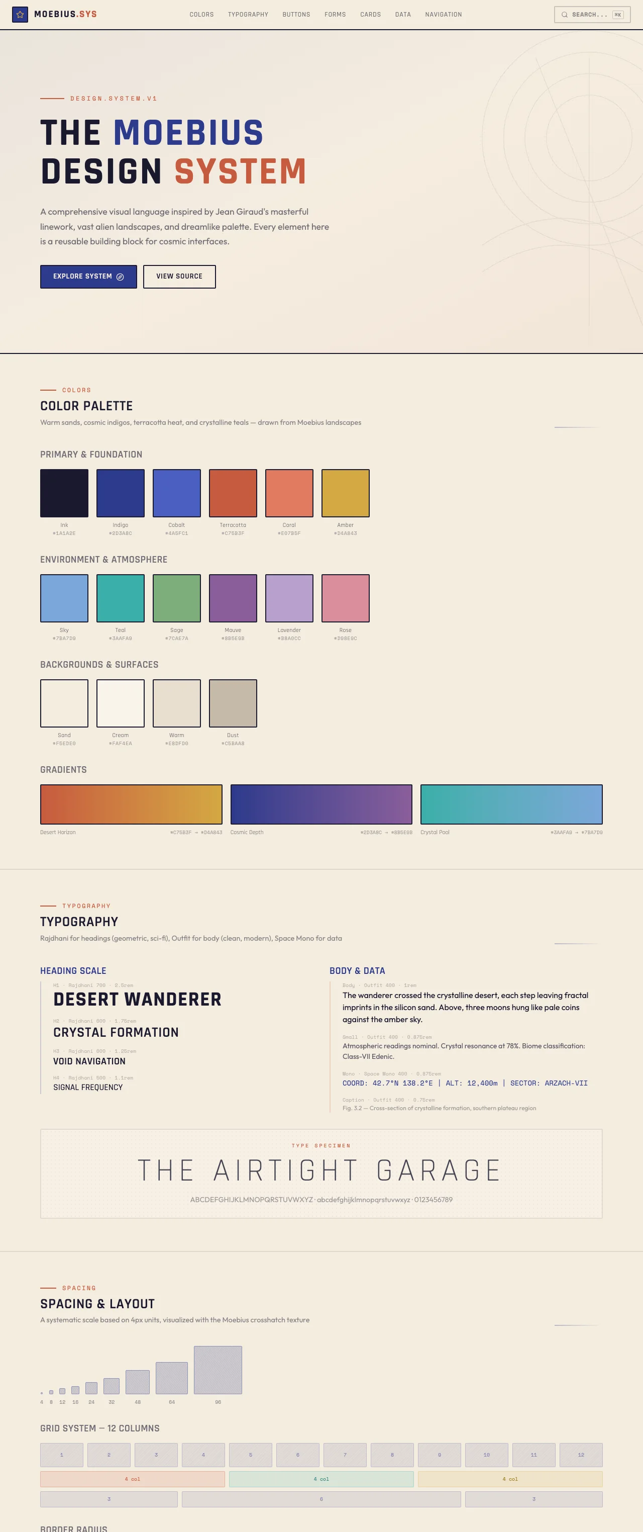
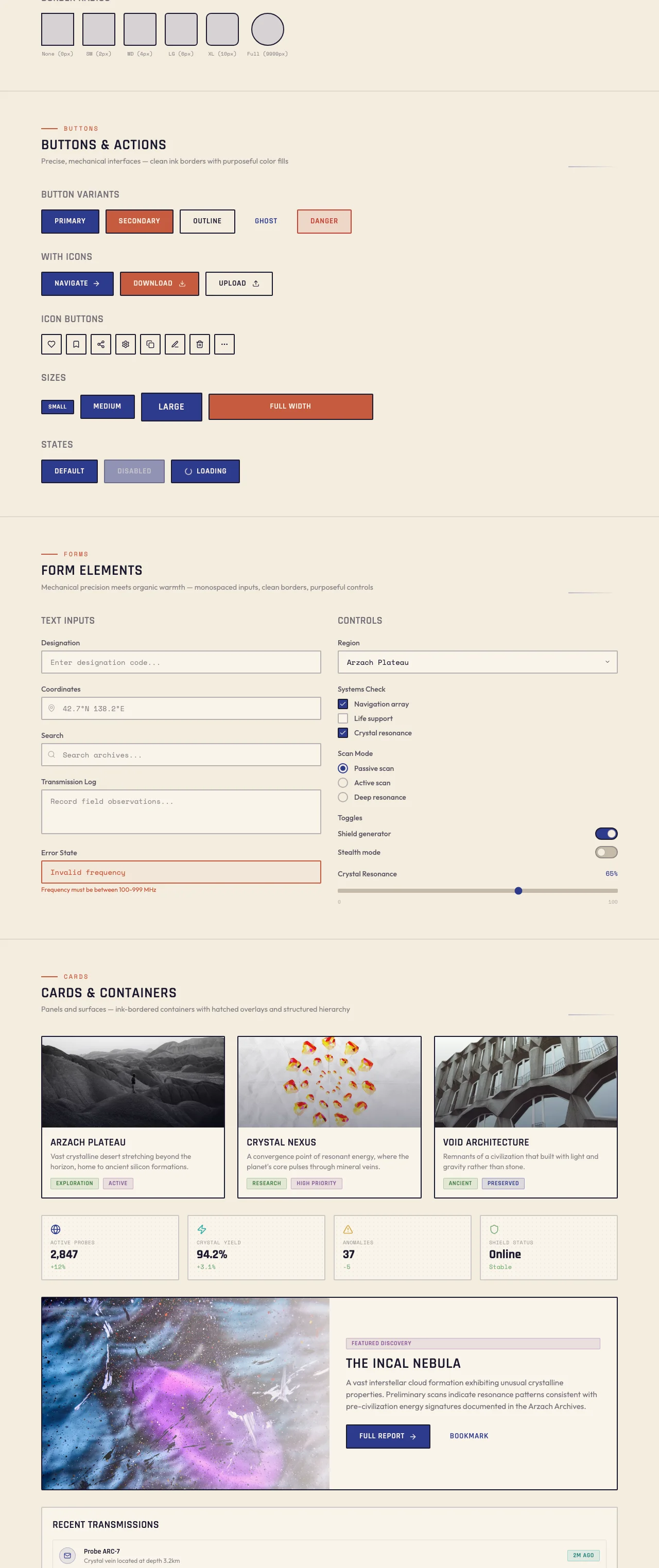
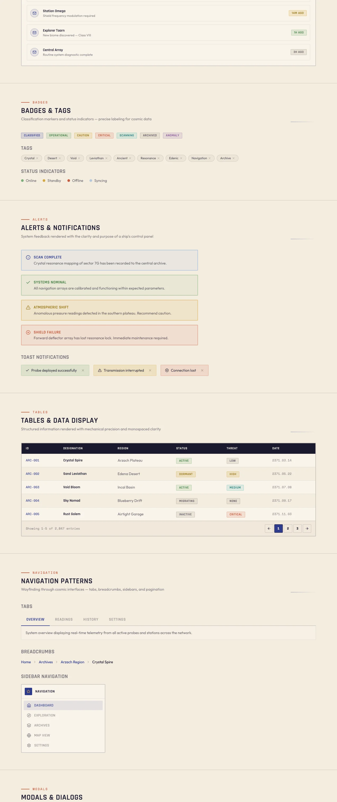
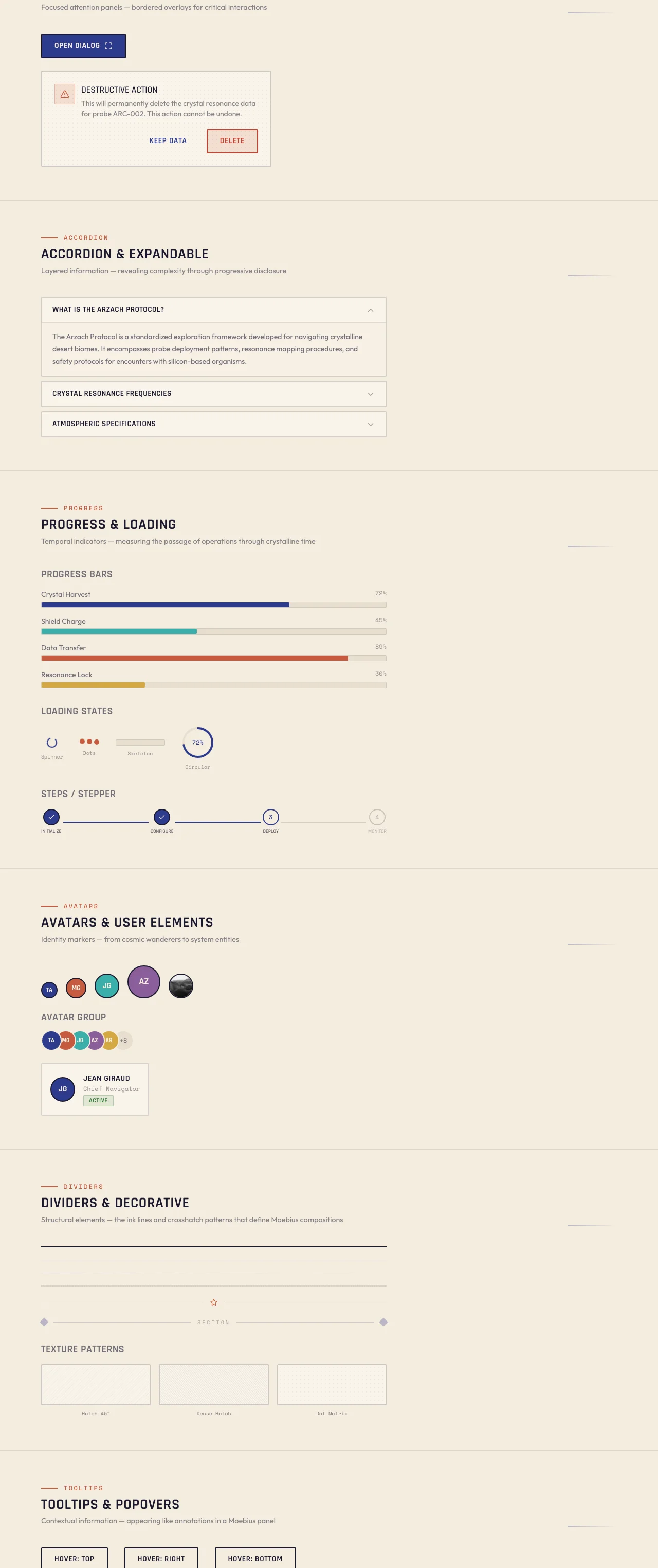
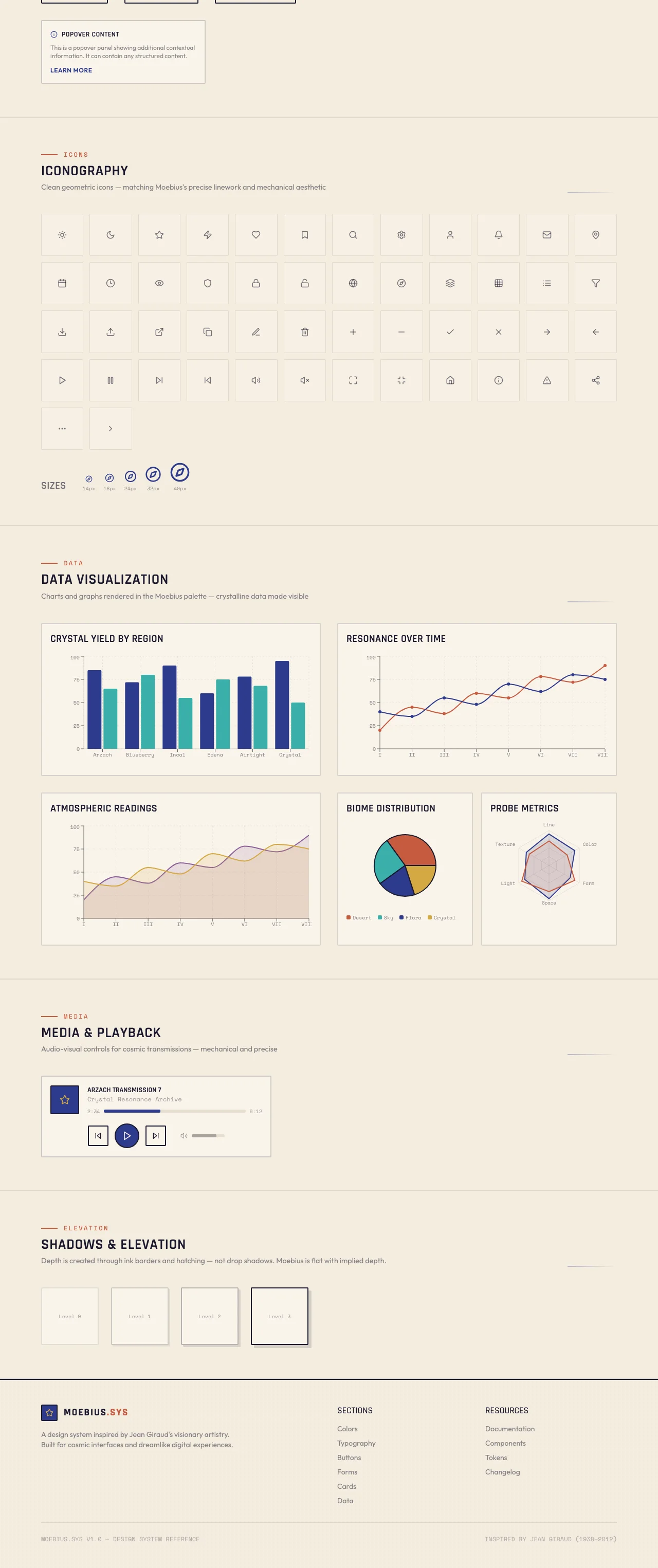
Section gallery
Section captures from the source Moebius design system. These ship inside the vibe pack as visual reference for AI-generated layouts.
Want the full Moebius pack?
The Moebius Theme Pack bundles this vibe pack with all 7 products — landing template, editor theme, portfolio, dashboard, email, and billing kit — same tokens, every surface.